

Click on any chart to see a bigger version that's easy to copy into a spreadsheet or presentation. Charts on paper printouts of metric PDF reports are curvy now too!

Pareto Charts now display vertical bars instead of horizontal ones.
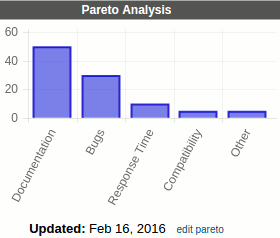
The Tags, and Responsibilities screens now show the new charts by default (like the Process Review screen). Choose Rolling 15 Months from the Show: Metrics drop-down to see the raw data instead of a chart.
No comments:
Post a Comment